Back when my studio space was mostly an unfinished shell, we decided to use an Ikea single (twin) size bed as a daybed. For months I had been struggling with just what to put in my space going back and forth between a sleeper sofa and a daybed of some kind. I wanted to avoid anything that took up too much space and most of the traditional daybeds seemed a bit heavy and bulky. As to the aesthetics of the piece, it needed to be a bit on the contemporary side and I wanted it to have interesting legs. The daybed needed to be comfortable for napping or to act as an extra bed should we have more overnight guests than the guest room could accommodate. Since its primary function would be a place for me to rest or read, I was intent on it looking more like a sofa of sorts than a bed.
Below you can see some of the stages it went through in its transition. I’m not finished yet and I have a design question for you at the bottom should you care to share your opinion.
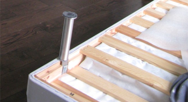
Here you see it upside down, resting on its thin Ikea mattress ( see the 2.5 inch pad underneath the larger frame)
This one has the contemporary legs I was looking for in my design.
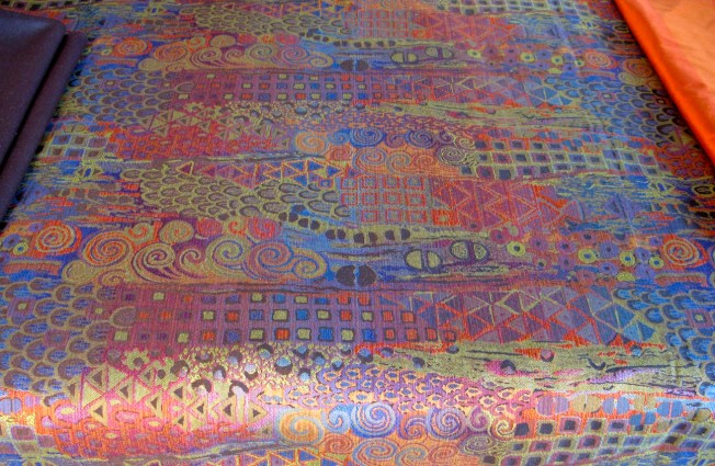
Do you remember when I gave you a preview here of the fabrics I brought back from my Thanksgiving visit to Atlanta?
It would be easy to wrap the bed like a package if you laid it out length-wise like in this picture.
Well, the easy way is rarely found in my vocabulary and I wanted the swirly waves in the design to move in an upward motion when you looked at the piece rather than across. Taking the pattern across would have required the least amount of work, but would have changed the energy of the fabric design so I got out my scissors and sewing machine … disclaimer here, I’m not very experienced with this machine (or any machine) and by no means what you would call a seamstress, but as is my way, I worked it out.
If you look closely you can see the seam where I joined the two pieces, but realistically who’s going to inspect it that closely besides me. I managed to get the upward motion of the pattern and after laying it out and lots of back and forth measuring and calculations, I set to work making it a more permanent part of the Ikea bed frame.
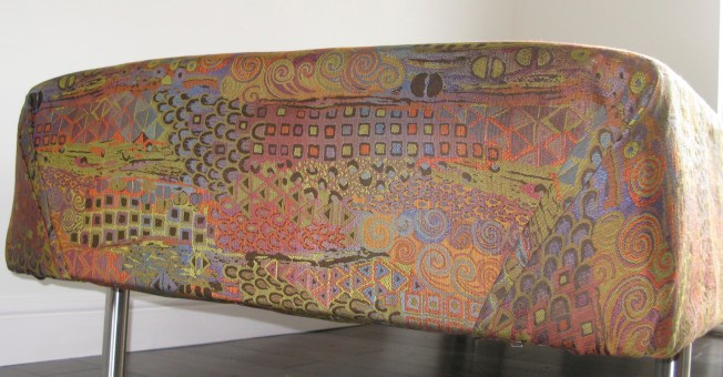
Armed with John’s staple gun, I went to work stapling it snugly to the frame tucking my corners so tightly that I almost felt as if I were back in the military. I moved back and forth from side to side in an effort to keep things balanced and did my corners (the end pieces) last.
It was important to me that both corners looked as close to identical in image as I could manage and I was pretty pleased with the results.
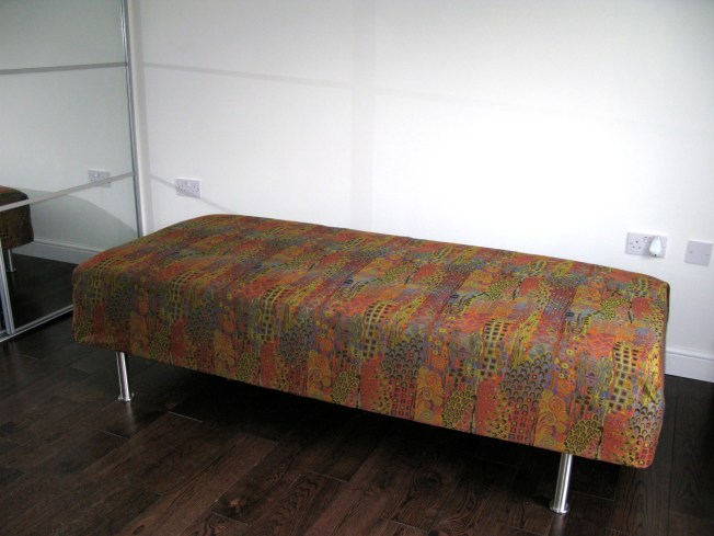
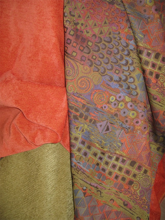
This was what it looked like at the end of my efforts. It really was a bit like wrapping a gift. Now remember when I said I that I needed a little help from you? Here is what I’m trying to decide and I would love to hear your thoughts. I have some fabric left that I want to use to make pillows. In keeping with the upward motion of the pattern, I have enough to make four good-sized pillows about 24 x 24 inches, but I want to use another fabric on the backside of each one. These are my choices below … green or orange. Both colors look great with the front facing patterned fabric, but I’m still not sure.
I considered backing all four with same color or mixing it up with two of each. You should know as you are making your decision that I intend to recover a chair in the green fabric and it will likely sit near the end of the daybed. I’m giving my bathroom a finally coat of paint today and then I need to get my pillows done this evening or maybe tomorrow.
John has done such a brilliant job with my bathroom that I can’t wait to show it off. Yesterday, he built a perfect wooden sink stand based my specific design requests. I am so pleased with how he was able to build it just as I described. Plus, I don’t know if you noticed in the pictures above, but there is a dark hardwood floor now that John put down where there used to be a raw builders floor waiting to be finished. I can hear the table saw from the garage where he is working on something … bookshelves I think, since he’s building them for my space and finishing the inside of my closet this week. After that, I’ll be ready to unpack my things and settle in. Please help me out with a suggestion below regarding the color for the back of the pillows and thanks for your interest and help.





if it were me I’d mix it up with two of each, then you can match the rest of the room more easily. Love the wrapping job you did on the bed – it is now quite unique!
i think i’m with Sam – two of each would be nice.
It looks so nice and i love the wood floors. can’t wait to see the bathroom!
The fabric is beautiful, reminds me of a painting by Gustav Klimt.
Lots of ideas, too many for here, but the bottom line is, YOU have to be happy with it – everything else and indeed every one else’s ideas, are irrelevant.
Looking forward to seeing which you decide, and why.
Well, here is a longer reply, hoping it is useful to others.
Showing me some fabric and asking me, “What do you think? I’d like your comments,” is like waving the red at the proverbial bull! I mean, you were talking to ME, right? So here are a few thoughts:
1. A little trick taught to me by my sister who is an interior architect & designer by training: When looking at a possible colour scheme, view it through squinched up eyes – if the tones are not about the same the ones that are different will pop out at you or seem to recede relative to the others. Having all the tones similar will create a harmonious feel overall even if the colours are very different and used as contrast.
2nd, consider how you want this room to work. You, who thinks a lot, will have many ideas about this. The answers I’m prompting here are around how you want to feel when you walk into it, when you work in it, and when you rest (very important!!) in it. By rest, I include mental and emotional freewheeling, relaxing, letting the ideas and the work you do settle and marinate, and letting the creative forces and juices and results formulate in their own good time. A studio that is your private nest may not be the same as a place that you showcase your work in, that the outside world physically comes into such as a gallery or a teaching space.
3. Physically, as you’ve chosen fabrics that reflect outside colours, do you want your inside room to kind of merge with the garden outside beyond the windows and sliding doors, or do you want the two to be distinct, with a bit of a boundary? For example, if you cover the orange part of the last pic above with your hand, you can see that the multi fabric ‘merges’ a lot more than green than with the orange, and if you want a seamless transition flow from garden outside to couch inside, green might be the better colour. On the other hand, if you really loves that orange, and like the punch of the contrast (orange is opposite blue on the colour wheel) don’t stint yourself. So your choice might be based on the feel and reaction, the experience you want to have in there.
4. You may find that, actually, different days suit different moods, and of course, seasons and weather will too. If you’re a decisive sort, you may want to get just get those cushions over and done and finished, …but on the other hand if you are still wondering and can bear to wait, you may find that draping the colours over the pillow pads and trying different variations out for a week or two or more, just to see how it feels over time, is useful. Or baste the different pillow sides together with big long hand running stitches, (half an inch each) and then unpick ’em in a trice once you think you know what combo you like best to sew up more securely.
5. Not getting those cushions DONE and finished in the next 24 hours is not necessarily prevaricating /procrastingaing / getting too much in your head. You may find once you let the colours in various amounts and combinations just sit with you without acting on them immediately, that you may/ may not want to re-create a touchstone of an earlier part of your life (orange), especially once you have unpacked and more familiar elements from “the rest” of your life are also around you.
So my gentle suggestion is to consider also the symbolism and the energy (yours) of what you want to do from here forward, of your dreams and hopes for what you will create, so that what you carry with you are things you truly feel put air under your wings, and are not (possibly unneeded) training wheels there in case you fall that might be extra weight that you don’t need or want and hold you back. Only you know will know what anything you chose is linked to, and it changes all the time. When you packed up your things and held a moving to UK sale, you were weeding out; here, you are building anew, in a new part of your life. Your momentum and inner self may be in a very different place even though if feels like the same arc of trajectory in the action, and only a few short months ago.
6. Whichever you chose, let it feel right, even if it feels risky, even if you chose to ‘risk’ a colour scheme or approach. You can always insure yourself by buying some more of that fabric from the USA maybe, the name will be on the selvedge and the internet yields many wonders. You’re usually paying dollars to sterling here so shipping from USA won’t put you hugely out of pocket.
7. Look through a camera lens backwards if you don’t have a quilter’s reduing glass to see the whole room, when checking for balance in forms, mass of colour, or just to see if it al feels like too much.
8. Your curtain material looks like slub (dupioni) silk. If so, this stuff can be quite susceptible to light damage, so protect it if you need it to last for longer than a few years.
The judges decision is final..until you decide to change it. How much fun is that?!
If it was me, I’d go for the blue! The overall effect is green so if you want something different to be brought out, i’d pick the orange, especially since the chair will be green. you don’t want to much green.
I love the orange, but I’m definitely not the best person to ask. You’ve had some really great advice from others. It’s definitely about the impact you want to create, the green seems a much more restful colour and won’t over stimulate the half and half is a compromise, you can change them about depending on your mood.
look forward to hearing your decision.
I think I’d mix it up – two of each..or three of one and one of another. Love the green!!!
Wow, great job on covering the day bed! I like the orange, but the green matches so perfectly, so I’m with those who said two of each.
I Mariellen has provided some great advice….the extent of my interior design knowledge is reflected in this observation: I like the way the fabric goes with the dark wood floors! See- not good. Go back and re-read Mariellen’s comment and then try that eye squinching thing…and pretend that instead of Mariellen’s name, you see ‘Suzanne’……
Looking at the top picture where you have the material laid out before you did any sewing, the green seems to pull the colors together, while the orange glaringly stands out. I like the green.
I would make pillow cases instead of permanent covers. You can then change the covers to match your mood or the season or what you put on the walls. Orange in fall? Green in Spring? Blue in the summer? If the cases get dirty, you simply pull them off and throw them in the wash instead of having to wash the whole pillow.
Back with you after a long time my friend. Glad to see your latest post and to know that all is well with you…
I’m liking Sandybee’s pillow cases idea a lot.
First I was for two of each. Then loved the idea of pillowcases so you can change. And someone mentioned blue … I adore blues and purples and that material looks like it has some GORGEOUS blue/lavendar/pink … which also look good with green (chair) …
I’m less an orange person – but orange looks so good with silvery stuff!
So the pillowcase idea kind of blew me away.
And can’t WAIT to see the bathroom!
Cheers.
So, dude.(ette).
Have you seen the little marks made by our noses on the glass, as we all lined up to peer in the window for the next exciting installment of which colour(s) you were going to use on the back of those pillows??!!